Thursday, February 24, 2011

When new looks old...

Today, I bring you a refreshingly quaint Spanish home just steps away from the Lunada Bay bluffs.  The Houston Residence.  It's nice when owners decide to go smaller rather than bigger, despite having the ability to go large and grand.  That's what the Houstons opted for in this home.

Built in 2007, the home measures a comfortable 4,209 square feet and sits on a flat 12,060 square foot lot.

(Source: NJC)


The home is owned by one of the principals from HoustonTyner Architects, a Marina Del Rey-based architectural firm.  I believe the owner was also the architect of the home.  The homeowners purchased the original ranch style home in 1997 for $662K.

(Source: Bing Maps)

(Source: Bing Maps)


(Source: Bing Maps)


There is a lot to like about this home.  Let's start with the size.  Too often today people feel the need to prove or self validate their sense of worth by building a monstrous home.  "Bigger is better."  "The bigger the home, the more important the person." Or so conventional wisdom goes.  With this home, rather than build a large imposing home, the owners opted to build a villa, a seemingly small and cozy home that has charm and character.  The home evokes a sense that its been there all along (although something about the garage door seems too new).  The white space on the facade.  The recessed door entry and windows.  The minimal sconces.  The low hanging tile roofs.  All exude charm and modesty.  This is not a "I've arrived" statement home.  This is a "home for family" - a "livable" home.

(Source: NJC)


At first glance, the home is very simple.  But as one looks longer, he can appreciate the nuances of the design.  The quirks.  The whimsy.  The fun things that make the home - things like the alternating roof lines, the angled chimney.  The interplay of boxes and shapes that make up the home.  Maybe I would change that garage door - maybe two small, one-car doors would make more sense.  Outside of that, I really do like this home.

(Source: NJC)


All the things the last post's home got wrong, this one got right.  Perfect lines.  Recessed this and that.  Well executed massing.  Everything is just right.  Kudos to Mr. Houston!


KEY STATS
Location: Lunada Bay, PVE
Style: Spanish
Year built: 2007
Architect: Gary Houston (est.)
Square footage: 4,209
Lot size: 12,060 (width 106 tapering to 80, x 131)

Friday, February 18, 2011

Now to a less glamorous Spanish home

I've been remiss in my blogging duties lately.  Work has been busy and I've been fighting a cold/fever for the last few days.  But I'm back.

Today's home is vanilla.  Not terrible, but definitely not remarkable.  The Ounanian Residence.  Built in 2010, the home measures 3,750 square feet and sits on a 10,130 square foot lot.

(Source: NJC)


Designed in 2009 by Reed & Reed Architects and finished in 2010, the home was originally built for the homeowners as a custom home not a spec house.  However, due to a number of factors, the homeowners decided to put in on the market in August 2010 for $2.295M.  The listing was ultimately removed in December - no record of sale.  Perhaps a market test?  In 2006-2007, the home would have easily cleared that price.

The homeowners purchased the original 1949 1,587 square foot home at the turning point in the market in late 2008 for $1.15M.

(Source: Google Maps)

(Source: Google Maps)


As you can see from the images above, the previous home was much more modest and didn't take much advantage of the very large lot.

(Source: Bing Maps)

(Source: Bing Maps)

(Source: Google Maps)


There are a few things I like about the home.  First, nice going on the courtyard and upstairs covered patio.  Different from what you generally see in new construction - and yet another point for what I have said all along - the wider the lot, the greater the design possibilities.  This lot is a pie shaped lot, starting at 66' feet wide in the front, and ending at 92 feet wide.  Given the setback of the home, I'd suspect that the facade starts at the 75 feet width mark.     Secondly, they've opted for two individual garage doors rather than one, dominating two-car door. Nice.

But then things start going wrong.  The garage and front library/office stick out too far from the main home.  Half that distance would have been more appropriate.

(Source: NJC)

(Source: NJC)


I'm all about minimizing massing, but the setback for the second floor is ridiculous.  Next, what's up with the windows?  You should all know by now I'm a stickler for windows being recessed in Spanish homes!!!  Also, why is the window trim black???

(Source: NJC)


What's more, those attic vents are just a joke.  PVE Art Jury - are you guys asleep at the helm???

(Source: NJC)


Last thing - I think the garage's roof is out of place - maybe too shallow?

(Source: NJC)

Overall, the home is a little off in parts.  From certain angles, it looks great.  From a great many angles, it looks like a home that needs a bit of work.  The concepts at play were admirable, but the ultimate execution left a bit to be desired.  What do you think?


KEY STATS
Location: Valmonte, PVE
Style: Spanish
Year built: 2010
Architect: Reed & Reed
Square footage: 3,750
Lot size: 10,130 (width 66 to 92, x length 132 to 123)

Sunday, February 13, 2011

Celebrity in the house! err... Celebrity is a house! (Updated)

Unlike San Marino, Pasadena, Beverly Hills or Malbu, it is very rare to see Palos Verdes featured on the silver screen.  In fact, I can think of only a few movies or TV shows that are set or filmed on the Peninsula (The O.C. used a number of PVE homes to double as Newport Beach; Kevin Kline's 2001 film Life as a House was filmed at the former Marineland site in RPV, which is now the Terranea Resort, but in the film it was a body double for Laguna Beach).  Part of the reason is that the cities on the Peninsula have very strict filming restrictions (mainly PVE and RH).  So when a home or part of the Peninsula is caught on film, its a rare treat!

This home was filmed in the the critically acclaimed (hah!) 2006 comedy Big Momma's House 2, starring Martin Lawrence.

(Source: NJC)

(Source: Ashai)

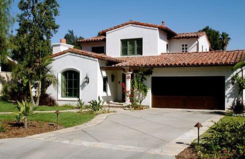
Designed by Ashai in 2004, the home measures a comfortable 6,046 square feet and sits on a flat, hilltop 0.4 acre lot.  In the movie, it was the home of the CEO of an IT company that was under FBI investigation by Martin Lawrence's undercover character.  I believe the movie was also set in Orange County.

There is a lot to love about the home.  Where to begin.  Let's start with the curb appeal and presence.  This lot is an irregularly shaped corner lot, which has one side curved and the other boxed, so it presented the architects with a unique challenge: which way shall the house face?

(Source: Bing Maps)


As you can see from above, the right hand (eastern) side of the lot is used simply as a driveway to a three-door garage.  I suppose that paved space could double as an impromptu basketball court if needed.  The facade has a semicircular driveway, and while most homes have backyards, this home instead opts for an expansive side yard.  So I think the home sits very well on the lot.

Next, massing.  This home is large.  Not obscenely large, but certainly not your average new home 3-4,000 square footer.  I like all the visual interest in the facade.  The alternating rooflines.  The very Spanish courtyard.  The various setbacks of the rooms - a hodgepodge of rooms cobbled together in a very capable way.

 (Source: NJC)

(Source: Google Maps)

(Source: Ashai)


The home feels classic, almost timeless.  While it is large, it feels cozy.  No McMansion feel here.  Ashai did a fine job making sure the features of the facade were as authentic as possible.  As most of you know by now, I'm a stickler for things like window recesses, shutters actually large enough to, you know, cover the window, white space, etc.  And this home's got all that and more.

(Source: NJC)


OK, OK, I know what you're saying - what about those second floor windows?  Shouldn't they too be recessed? You're right.  Perhaps six inches would have done the job.  How about that courtyard gate?  Very nice.

Lets switch to the back...err side yard.   This is the ocean-facing side of the home.

(Source: Bing Maps)

(Source: MLS)

(Source: MLS)

I love the side yard.  Sure there's no pool, just a big grassy area.  But look at the home. Two second floor balconies.  An arched first floor walkway.  Only thing I question is whether or not I would have preferred the second floor balcony on the left to be set back rather than overhanging the first level.  But a minor point.

This home was built as a spec house and the developer bought the lot in 2002 for $875K, went though the painful PVE approval process, and ultimately sold the home in 2005 for $3.5M.  It sold once more a year later for $3.8M.  (Quick aside: Funny enough - the owner that bought this home in 2006 is the CEO of an IT company that provides software solutions for law firms!  Similar to the movie!  In fact, he and his wife traded up from a smaller home in Lunada Bay which they had just sold for $1.9M).  The owners decided to sell at the worst possible time (October 2008) when they listed it for sale at $4.3M and chased the market all the way down over two years until it finally traded September 2010 for $3.2M.

Overall, a very lovely home I wouldn't mind calling my own

UPDATE: So I was perusing through my cable box and saw Big Momma's House 1 & 2 was playing this weekend (I'm guessing to promote the third installment of the series which is now out in theaters).  So I was able to grab a couple of screen caps (see below).  They also show shots of the Peninsula and of neighboring Redondo Beach as well.  Note that the interior of the home was not used in the film.

(Source: 20th Century Fox)

(Source: 20th Century Fox)


KEY STATS
Location: Monte Malaga, PVE
Style: Spanish
Year built: 2004
Architect: Ashai
Square footage: 6,046
Lot size: 18,740  (241 curve x 154 deep x 177 rear width)

Saturday, February 12, 2011

Swamped with work, but new post coming tonight!

Work has got me swamped the last few days, so that's why I've been a bit negligent with my HoPV duties.  But fret not!  New post coming tonight!

Tuesday, February 8, 2011

Close, but no cigar.

OK, so yesterday I wrote about  one of my favorite homes in all of PV.  Today, I'm going to highlight a home that attempted a similar facade, but came up short.  It's not an ugly home, but its just not in the same league as yesterday's home.  The Simpson Residence.

(Source: EnviroTechno)


Designed by EnviroTechno in 2007, the home spans 3,138 square feet on a generous 11,990 square foot lot (79x156).  The property was purchased in 2006 for $1.4M and the original ranch home was torn down to accommodate this Spanish-esque home.  There are few things I like about the home.

 (Source: Bing Maps)


 (Source: Bing Maps)


For starters, I do like the garage and the angle of the garage roof.  I also like the vegetation around the home, and from certain angles, the home also seems well balanced.

  (Source: NJC)


 (Source: NJC)


However, on its own, absent the greenery, the home leaves much to be desired.

Number 1. The windows should not have the McMansion trim around them and they should not be flush with the wall.  Spanish homes must  have recessed windows.  If they have trim, think Spanish tiles not picture frame.

Numero 2. What's with that column in the doorway? Its too thin and is unbalanced with the mass of the protruding central room.  Either add an additional column or thicken this one.  Good thing it has the vines growing otherwise it would look naked and out of place.

Thirdly. The window on the second floor shouldn't abut the roofline.  It should float.  And it should have two panes, not three.  And why do the panes have such thick borders? I know the window opens, but it doesn't at all match the thinner (and preferable) pane borders on the lower window.

(Source: NJC)


Last of all.  Is it me, or do the angles of the roof seem too shallow - flat even? I think they need to be a tad steeper to help add visual interest and reduce overall massing.  Agree?


(Source: Bing Maps)


The property overall just seems dull.  Even the footprint of the home has no interest - just a mass of wood, tile and stucco.  No ingenuity - no "hmmm" or "aaahhh" factor - just ordinary.  Ditto on the backyard.  No pool.  No spa.  No fountain.  Just a grass yard.

Also, did anyone notice the lush front and back yard vegetation in the original home? The new home has most of those mature trees removed - what a waste! ...and all for for a home of meager architectural quality, what a crime!


KEY STATS
Location: Valmonte, PVE
Style: Spanish
Year built: 2007
Architect: EnviroTechno
Square footage: 3,138
Lot size: 11,990 (79x156)

Saturday, February 5, 2011

A modest Spanish retreat

Today I thought I'd head back to Valmonte and check out another nice original PV home - one of my Top 10 actually.  The Paull Residence.

(Source: Pritzkat & Johnson)

(Source: PV Library)


Originally designed and built for Robert G. Paull (yes, two "L"s) in 1927 by Kirtland Cutter (of Gard Residence fame) and Francis Schellenberg respectively, the home measures 4,195 square feet and sits on a wedge shaped 13,520 square foot lot .  I have to say I'm a big fan of Cutter's California work.

Quick aside: Kirtland Cutter was a prolific architect in the Pacific Northwest (notably Spokane) and designed a great many structures during his tenure there in a variety of styles (though predominated by Arts & Crafts).  Amid financial problems in the early 1920s, he moved to California at the young age of 63 (!) in 1923 and began exploring his fascination of the Mediterranean style until his death at age 79.  Cutter was an admirer of George Washington Smith, Wallace Neff and others, California contemporaries at the time, who had spearheaded the California interpretation of Spanish/Italian design.  His first design in PV was that of Lunada Bay Plaza (which never came to fruition, see below).


(Source: PV Library)


In total, Cutter designed 16 homes in Palos Verdes.  The Paull residence was actually one of the first "spec" homes (speculative) in PV - funded and built by Schellenberg and later sold to Paull.  It faces the golf course and was one of the first homes to incorporate a large garage on the primary facade.

(Source: PV Library)

(Source: PV Library)


Normally, I'm not a fan of garages facing the street.  In select cases (like the Contratto Residence), the front facing garage actually works very nicely, largely because there are other elements of the facade that distract and overpower the garage door.  Such is the case here.  There are numerous points of interest on the facade.

(Source: NJC)

(Source: NJC)

(Source: NJC)


From the 35 degree angled room and covered second-floor porch to the alternating protrusions of the facade, there's so much to visually enjoy.  The vegetation and semi-circular driveway also contribute to the grand yet understated feel of the home.  The current owners purchased the home in 2001 for $1.9M and then hired Pritzkat & Johnson to assist with a remodel and facelift.  Notice subtle changes to the front facade.  No shutters on the first floor window. The addition on the left including a small chimney.  Lights around the front door.  The additional window on the second floor.  New attic/chimney vents on the front. More prominent secondary chimney.  Etc.  And notably, the addition of a semi-circular driveway (which I admit, may have already been added in a 1954 remodel according to public records).

(Source: NJC)


If we go to the rear of the home,  you'll see a very nice terraced courtyard with what looks to be a paved patio with a central fountain and a lower garden that leads to the pool area.

 (Source: Bing Maps)

 (Source: Bing Maps)

(Source: Bing Maps)


Overall, I like the remodel.  Pritzkat kept the essence of the home and highlighted its strongest qualities - Cutter would have been proud! It feels elegant, timeless, and most of all, comfortable.


KEY STATS
Location: Valmonte, PVE
Style: Spanish
Year built: 1927 / 1954 / 2000s
Architect: Kirtland Cutter / unknown /  Pritzkat & Johnson
Square footage: 4,195
Lot size: 13,520 (98x184..tapering to width of 57 feet)

Tuesday, February 1, 2011

New life for an Old World home

Looking through my notes over the years, I thought this time I'd write about one of the largest properties on the Peninsula: the Don Lawyer Residence.

(Source: ECB Associates)

(Source: PV Library)


Originally designed (and built) by John Byers in 1926 for Donald K. Lawyer and his wife (one of the original sales managers for the Palos Verdes project), the home sits on 3.2 acres, one of the largest parcels on the Peninsula.

(Source: Bing Maps)

(Source: Bing Maps)

(Source: PV Library)


Originally designed and built in 1926, the home underwent an extensive remodel and expansion in 2006.  The current owner, a retired telecom executive, purchased the original home in 2000 for $6.9M and proceeded to undertake the extensive $6M remodel shortly thereafter.  The new home features over 12,060 square feet of living space, 5 bedrooms, 11 bathrooms, a tennis court, swimming pool, long private driveway and circular motor court.  Unlike many other homes featured on this blog, this estate is very private and hidden from view by tall hedges and trees (although as you can see above, when the home was first built, there was very little vegetation in the area).

As you can see from the photos, Ed Beall took his stylistic cues from the original (more modest) home and underscored the informality of the Spanish design to compensate for the sheer size of the new home.  I think the Spanish style screams - or perhaps whispers - informality, familiarity, casualness.  It feels comfortable.  Like the fictional Montecito home of Meryl Streep's character in the movie It's Complicated.

(Source: ECB Associates)

(Source: PV Library)

(Source: PV Library)


As you can see above, much has changed in the front facade.  The most notable change is the addition of a tower above what was a single-story entry way.  Similarly the patio area off to the side has been enclosed and turned into a two-story extension of the main structure.  Other differences - the conversion of the old garage into what looks to be a guest house (thank god!) - the garage is now just off the motor court on the lower level of the home.

In the rear of the home, you can see even more drastic changes.

 (Source: ECB Associates)

(Source: PV Library)


Where to begin.  On the far right, you'll notice the addition of an arcaded walkway with thick arches. While they look nice, I fear they may be out of scale with the rest of the first floor - why???  To the left of the arches, the rear of the home (from the windows to overall silhouette) remain largely intact.  In the expansion on the left, Beall did a good job keeping the same angles in the covered patio and also kept the windows consistent with the original structure.  I don't quite understand why Beall didn't keep the arches in this walkway (instead he has square support columns).  In my mind, it makes the expansion look like a remodel done at a different point in time - it makes the home look mishmashed.  I also question why the roof over the walkway/patio terminates into a large stucco wall - shouldn't it terminate above the wall?

Overall, I like the home.  It's no Gard Residence to be sure, but its a very nice example of a rambling Spanish estate.  What do you think?

Update: This home will be part of the Palos Verdes Art Center's 2011 Home Tour Extraordinaire on April 15 & 16.  Ticket info and whatnot not yet available, but I'm guessing it'll be similar to last year's tour prices ($40-50) and you get to tour 3 amazing PV homes.  Let me know if you plan on going!


KEY STATS 
Location: Lunada, PVE
Style: Spanish
Year built: 1926 / 2006
Architect: John Byers / Ed Beall
Square footage: 12,061
Lot size: 3.2 acres