Friday, December 30, 2011

Densification alert - Update - Part 1

Happy Holidays to everyone!  In the true spirit of giving, one HoPV reader has kindly sent me some more information about the plans for one of the double-wide lot teardown candidates (click here and earlier post here) I wrote about.  Well, as I had feared, indeed the owner of these lots has elected to split them back into their two very small constituent lots, totaling roughly 6,200sf each (with 60-foot frontages).

(Source: Google Maps)


On the larger of the two lots, 1609 Via Garfias (which totals approx 6,500sf), a 2,880sf home with a two-car garage is proposed.  The home has 5 (!) bedrooms and 3.5 baths.

 (Source: TT)


(Source: TT)

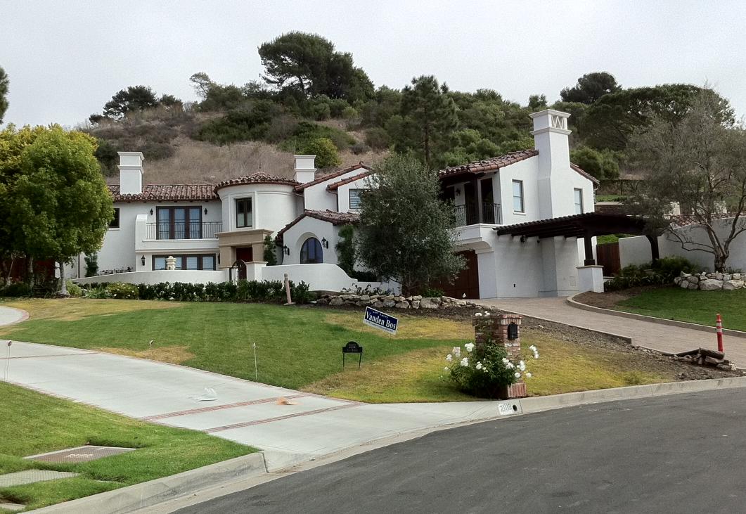
As you can see from above, the home is Spanish in style.  There are a few things I like about the home.  First, the layout is unique - its not like the usual quasi-symmetric new build facades you see like the Doug Leach Lunada Bay I wrote about before.  Similarly, the fact that there is a little courtyard on the right side provides additional space for convening and gathering - a plus.  But unfortunately, that's where my accolades for the home end.  Let's start with the garage - the walls around the door look a bit on the skinny side.  The garage door itself? Not a fan of the panels - but lets at least hope they're actually made of wood and not the brown-painted plastic variety.  Do they really need a set of stairs leading from master to the courtyard?   I like the idea if it were an interior courtyard, but for an exterior one that leads to the outside? I'm on the fence.  On the windows, the scale is right but the proportions and placement look a bit off.  The top of the windows abut the molding and my guess is they're not properly recessed.  The entry tower, while I love the idea, looks undersized relative to the two other masses and garage.


First floor:


Second floor:

I like the uniqueness of the first floor layout.  Its different.  Unpredictable in some ways.  The living room is cozy, the foyer is equally snug.  It's nice walking into a house and not being able to see straight through to the backyard.  It's equally nice to not face the stairs upon entry (and bad feng shui!).  I'm not crazy about the placement of the guest bedroom door - it's directly in front of the entry.  The family/dining room and kitchen area are superb, though.  I really like the sizing and layout.  On the second floor, the rooms are small.  12x12 is hardly ample space for a luxury custom home bedroom.  Also, to have only one shared bathroom to accomodate THREE small bedrooms, obviously this architect doesn't have kids!  

All in all, the numbers don't lie.  2,900 square feet is not enough space to fit 5 decent bedrooms, 3.5 bathrooms, a formal living room, a dining area and full size family room and kitchen.  Its just too small for the size.  To add to that the lot is only 108 feet deep or so, with the home itself taking 70 feet of that plus 20 feet for a driveway.  That only leaves 18 feet for the backyard!!!

Like I said before, the buyer of the lot should have put a nice sized 4,500sf home on the double lot rather than crowd it with two undersized homes.  PV is not the place for densified living!  That's what the beach cities are for!!!

More on the second home to be built here later.  Stay tuned.


Wednesday, December 14, 2011

Cape Cod estate in Valmonte

So I hinted at this home in an earlier post - it is one of my favorites in Valmonte.  It is large, well situated on the lot, and has loads of character: the Westley Residence.

(Source: Google Maps)

(Source: NJC)


Designed by Doug Leach and built in 2007/8, the 5,600 square foot home sits on a double lot that spans 18,270 square feet!  The original single-level ranch home and lot were purchased in 2004 for $1.8M by a Yale PhD/cell and molecular biologist and her husband, a real estate developer (himself, a Cornell & Harvard grad).


 (Source: Bing Maps)

(Source: Google Maps)

As you'll notice, the new home is sited in nearly the identical spot as the home it replaced - even the garage is in the same spot!  The lot itself, at nearly half an acre, is among the largest in Valmonte.  It actually spans two legal lots, each roughly 64x143.


(Source: LA County Assessor)

There's a ton to love about the home.  The wrap-around porch.  The color and texture of the exterior shingles.  The landscaping. The alternating roofline and mix of windows.  The size and substantial-ness of the porch columns.  The color combo.  All in, a very comfortable family home. 

The rear elevation is equally attractive and the back yard landscaping is elegant yet simple.  In fact, I think it looks as though it has some neat features like a NanaWall, which opens up the family room into a stone patio.


 (Source: Google Maps)

If I were to nitpick, here are a few things I would highlight: the windows in the garage door (which are actually a no-no in PVE and violate the Art Jury's guidelines).  I think having windows in a garage door detracts from the house - cheapens it, perhaps.  A paneled or solid white garage door would be better (an easy fix too!).


(Source: Google Maps)

(Source: NJC)


The front setback - well, here I'm on the fence.  On the one hand, the 30-foot front setback (or technically, "side" setback since its a corner lot) makes the home seem more comfortable, informal and welcoming.  At the same time, a deeper setback of maybe 50 feet would make the home seem a bit more formal, grand even,  in keeping with both the size of the home and the lot size.  Obviously something like this is a bit too much  (80-foot front setback)


 (Source: NJC)

All in all, a very well executed home.  Funny enough, I came across another home in neighboring Redondo Beach and Torrance that both have some similar features and a comparable design.  Curious: what do you all think of its Redondo Beach and Torrance doppelgangers (not sure who the architect is here)?

Redondo Beach:
(Source: NJC)

PV:
(Source: Google Maps)

Torrance:
(Source: NJC)


Which one do you think is more attractive?


KEY STATS
Location: Valmonte PVE
Style: Cape Cod
Year built:  2007/2008
Architect: Doug Leach
Square footage: 5,600f
Lot size: 18,270 (127x143)

Tuesday, December 13, 2011

Quasi topical: Interesting article on evolution of LA

Interesting write up on the KCET website which I thought was interesting (and mentions Palos Verdes!).  It's entitled "How We Got This Way (Los Angeles Has Always Been Suburban)"

http://www.kcet.org/updaily/socal_focus/commentary/where-we-are/how-we-got-this-way.html

Check it out. 

Also, more of my regular home posts are coming! Stay tuned!

Saturday, December 10, 2011

I'm on Facebook!

I've finally joined the billions on Facebook.  Feel free to Friend me!

http://www.facebook.com/profile.php?id=100003219497096

Also, saw in the news that PVE and RPV were recently named one of the best places to live by quality of life.  Here's a link to the Daily Breeze article (Note that it is a ranking of cities with at least 10,000 residents - sorry, Rolling Hills (pop ~2,000)  and Rolling Hills Estates (pop ~8,500)!)

Also, for those wanting to see the actual data, check that out here: The Business Journal/On Numbers Report

Top Southern California Cities By Quality of Life
1. San Marino
2. Coto de Caza
3. Palos Verdes Estates
4. La Canada Flintridge
5. Calabasas
6. Manhattan Beach
7. Malibu
8. North Tustin
9. Coronado
10. Newport Beach
11. Irvine
12. Laguna Beach
13. Sierra Madre
14. Rancho Palos Verdes
15. Agoura Hills
16. Aliso Viejo
17. Rancho Santa Margarita
18. Hermosa Beach
19. Yorba Linda
20. Beverly Hills
21. Claremont
22. Solana Beach
23. Laguna Niguel
24. Carlsbad
25. Encinitas

Top California Cities By Quality of Life
1.  Hillsborough
2. San Marino
3.  Blackhawk (Danville)
4. Coto de Caza
5. Palos Verdes Estates
6. Piedmont
7. Orinda
8. Alamo
9. Los Altos
10. Saratoga
11. Tamalpais-Homestead Valley
12. La Canada Flintridge
13. Palo Alto
14. Granite Bay
15. Calabasas
16. Manhattan Beach
17. El Dorado Hills
18. Danville
19. Lafayette
20. Mill Valley

Congrats also to fellow South Bay cities Manhattan Beach and Hermosa Beach.

Saturday, November 19, 2011

The season for tear downs and build ups

So my post today is half update and half rant...

First, does everyone remember this post about a double-wide lot for sale in upper Lunada/Montemalaga?  Well that home finally sold for $1.04M not too long ago.  The 120-foot wide lot is undergoing the planning process in the city of PVE at the moment, and it looks like the architects hired for the job are Cauthen Design (http://www.cauthendesign.com/). 


From the website and the planning documents, Cauthen is run from a home in Huntington Beach.  If you look at some of the houses they've done, they look all very McMansion-y and Mock-terranean-ish.  See Exhibits A, B and C below.

 (Source: Cauthen Design)

 (Source: Cauthen Design)

 (Source: Cauthen Design)

The last photo there is not as offensive - actually, it's not half bad.  The first two, however, look like tract homes from Riverside or Ladera Ranch - yet both are actually homes here on the Peninsula!  Let's keep our fingers crossed and hope that whatever "Fias Homes LLC" has decided to build is tasteful and takes full advantage of the wide lot. 

Now onto another new home about to go up.  This one is in Valmonte and actually replaces a mid-century home that was designed by a regionally famous architect.

(Source: MLS)

This Valmonte home was actually purchased by Rick Tomaro, brother of architect Louie Tomaro and who is responsible for Tomaro Design's Construction Services division.  He and his wife currently reside in an RPV home which they have just listed for sale at just under $1M (see below).  That home, built in 1962, was remodeled by Tomaro to reflect modern living while retaining most of its 1962 quasi-Crafstmen style.

(Source: Google Maps)

So it looks like the Tomaros are moving on up from RPV to PVE, from a 1,972sf home on a 9,147sf lot to what I can only imagine will be a brand new 4,000sf home on a generous 10,800sf lot in the heart of Valmonte.  The Tomaros bought the Valmonte property in September for $905K.  It was originally listed at $829K as a short sale (the previous owners bought the home in 2007 for $1.15M).  It is worth noting that the Valmonte home has some architectural heritage and its a shame that this undercared for mid-century home will be lost.  Rick Tomaro has hired his brother Louie to design a new home for this property.

The 1,312sf  1950-build home sits on a corner lot, which measures 100 feet wide by approximately 108 feet deep.

(Source: Google Maps)


Let's hope here too that Tomaro works his magic and designs something tasteful - either a traditional/Cape Cod style home or a subtle Italian home.  Tomaro has very limited experience with the Spanish style, so its unlikely that this home will employ that school of architecture.  My guess, based on their previous home in RPV, is that he opts for something more tastefully American.  Maybe something like the below:


Or this:


Both are tastefully done, new construction Cape Cod/Traditional style homes in Valmonte.

Friday, November 18, 2011

Valley ...err Lunada Bay home hits the market!

Remember that bluff-adjacent "italian" home I blogged about here and here? Well, it finally hit the market (see photo below).  The home, which measures 5,297sf, sits on a bluff adjacent 15,700sf lot.  The lot itself was purchased for $1.5M the end of last year.  This mock-terreanean home is listed at $3.8M.  Some quick simple math - 5,297sf of living space plus 600sf of garage space is 5,897sf of gross space.  Assuming a range of $200 to $250/sf construction costs, that implies a total cost of $1.2 to $1.5M.  If we take out 5% realtors' commissions off the asking price, Mulligan and Co stand to make a tidy profit of between $600K to $900K.  Can't wait to see how (bad) the interiors look.  Stay tuned.

Updated! More pictures posted from MLS listing (see below).


The interior of the home is equally bland.  Its standard fare for spec builds in the area.  The ceilings look low for a new build - 8 or 9 feet, not the 10-feet you see in higher end builds.  The kitchen looks 'builder grade', ie whatever was on clearance at Home Depot.  The entryway looks poorly thought out and planned - a singular door that plops you right in front of the stairs - no double-height foyer, no particular architectural details, nothing.  This home is thoroughly uninspired.

KEY STATS
Location: Lunada PVE
Style: Italian
Year built:  2011
Architect: Jesus Meza
Square footage: 5,297sf
Lot size: 15,700sf (irregular)

Thursday, November 17, 2011

Some "before" pictures

Remember that Tomaro Tuscan in Montemalaga (link here) ? Well I found some under construction photos of the home which was managed/built by TriSam Development in Torrance.  Enjoy!


(Source: TriSam Development)

Thursday, November 10, 2011

Money may buy you many things, but taste isn't one of them

So today I just thought I'd do another quick post.  Remember that Lunada Bay Spanish home that's listed for sale for $2.8M designed by Doug Leach?  Well, its basically done and I'm not a fan!

Judging from the updated MLS pictures, it looks like Mulligan/Leach opted for some beige derivative for the exterior color instead of the more authentic white.  Also, as I suspected earlier, the front is too busy.  Too much going on.  The windows are too big, too ornate with lights on either side, a column separating the two panes.  Insufficient white space separating all the ornamentation on the facade.  Also, why oh why did Mulligan opt for a cheap plastic garage door that was painted brown?  Why not splurge the extra cash on an authentic wooden garage door?  If you're spending $1M on construction costs, what's an extra few $K? 

Can someone explain to me why there is a small wall separating the driveway and the entryway?  If you opt for parking your car in the driveway and want to enter the front door, why must you walk all the way around to the pedestrian path?

 (Source: MLS)
(Source: MLS)

I understand the lot is width-constrained.  This lot I believe is 67 feet wide, implying that the home itself is approximately 50 feet wide.  That is still plenty of space.  Especially considering that several other homes have managed to achieve creative, tasteful, and restrained designs even on 60' wide lots in which the facades are constrained to 43' wide.  Take for example this other home in the Valmonte neighborhood which is also listed for sale at $2.4M.


 (Source: MLS)

(Source: Google Maps)

That 3,683sf home built in 2001 sits on a comparatively small 7,886sf lot which is about 63' wide.  Yet despite these constraints, the home has loads of architectural features - all tastefully done.  It's not one big mass of a home with faux Spanish or faux Italian elements.  Its authentic.  Its well done indeed.

Even the siting and layout takes advantage of the natural features.

(Source: MLS)

I'm not sure who the architect was on this project.  The original homeowners, who have listed this home for sale, bought the lot with an older home on it in 1998 for $750K.  They tore that home down and built this beauty in 2001.

KEY STATS
Location: Valmonte PVE
Style: Cape Cod
Year built:  2001
Architect: Unknown
Square footage: 4,000sf
Lot size: 7,886sf (63'x130')


I have to say, that despite the atrocities of the Leach/Mulligan Spanish home, there are some truly beautiful homes in PVE.  Furthermore, for all my issues with the Art Jury being asleep at the wheel, they have at least prevented some absolute extremities of design from popping up in the city.  Unlike Beverly Hills.  Check out this home below, which is currently listed at $5.8M and spans 8,675sf.  The listing description heralds the house as a "one of a kind" home "with French and Italian style."  I think the photos say it all - no further commentary needed.


(Source: Google Maps)

(Source: MLS)

Thursday, October 20, 2011

Are we in the Valley?

Quick updates today.  Remember that monstrocity in Lunada Bay that I wrote about (more here) ?  Well, my fears were confirmed when I checked out the progress being made.  Here's what the first of the two homes looks like as of last week.

 (Source: NJC)

(Source: NJC)

This is a cartoon of a home if I ever saw one.  It's a block.  Well, three blocks.  With windows.  Lots of them.  Close together.  Doors.  Lots of them.  Close together too.  And the three car garage!  The siting and massing of this house is atrocious!  And what's more, rather than even attempting to have any semblance of authenticity by say, painting the home white and using a deeper red tile, the home is yellow.  With orange tile.  I mean, if you're going to go with something that is overly simple, at least do it well.  This home is a McMansion.  The kind you normally find in the Valley or Riverside County.  It does not belong on a bluff top lot in PV.

If the owner/builders were going for the symmetric, stately yet informal, balanced facade look, they could have gone with this home below which was built last year in Beverly Hills.  While this home too is imperfect, it still is head and shoulders above the Paseo del Mar McMansion!

 (Source: NJC)

(Source: NJC)

This example is a simplified, somewhat symmetric and balanced facade. The BH home has the right color palette.  Better massing.  The design is restrained, graceful even.  Sufficient white space.  Etc.

What do you all think?


Also, one other quick update.  The other home I wrote about is nearly complete - and its a beauty!
You remember this one? Well here it is, all grown up!

(Source: NJC)

We need more homes likes this!  Unique, authentic designs.

Tuesday, October 11, 2011

Since we're on a Tomaro theme...

Thought I'd drop a quick note today on another project of Louie Tomaro - this one isn't in PV - it's in Manhattan Beach, where Tomaro Design does most of their work.  In this home, on 1st Street, Tomaro, the architect on the job, remodels the interior by reversing the floorplan to move the living spaces back downstairs.  This is to accomodate some property acquisitions of the homeowners in which they added  a large lawn, pool and pool house (see aerial below).  The 6,650sf home now sits on a very large (by beach cities standards) 13,200sf lot.


(Source: Google Maps)


One of the other remodels Tomaro did to the home - and the reason I'm writing this post - is converting  the Italian-esque/McMansion exterior to a "softer, Santa Barbara" style.   What do you all think of the changed facade?


Original:
 (Source: Google Maps)

New:
(Source: Tomaro)