Today's home is vanilla. Not terrible, but definitely not remarkable. The Ounanian Residence. Built in 2010, the home measures 3,750 square feet and sits on a 10,130 square foot lot.
(Source: NJC)
Designed in 2009 by Reed & Reed Architects and finished in 2010, the home was originally built for the homeowners as a custom home not a spec house. However, due to a number of factors, the homeowners decided to put in on the market in August 2010 for $2.295M. The listing was ultimately removed in December - no record of sale. Perhaps a market test? In 2006-2007, the home would have easily cleared that price.
The homeowners purchased the original 1949 1,587 square foot home at the turning point in the market in late 2008 for $1.15M.
(Source: Google Maps)
(Source: Google Maps)
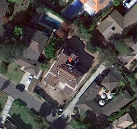
As you can see from the images above, the previous home was much more modest and didn't take much advantage of the very large lot.
(Source: Bing Maps)
(Source: Bing Maps)
(Source: Google Maps)
There are a few things I like about the home. First, nice going on the courtyard and upstairs covered patio. Different from what you generally see in new construction - and yet another point for what I have said all along - the wider the lot, the greater the design possibilities. This lot is a pie shaped lot, starting at 66' feet wide in the front, and ending at 92 feet wide. Given the setback of the home, I'd suspect that the facade starts at the 75 feet width mark. Secondly, they've opted for two individual garage doors rather than one, dominating two-car door. Nice.
But then things start going wrong. The garage and front library/office stick out too far from the main home. Half that distance would have been more appropriate.
(Source: NJC)
(Source: NJC)
I'm all about minimizing massing, but the setback for the second floor is ridiculous. Next, what's up with the windows? You should all know by now I'm a stickler for windows being recessed in Spanish homes!!! Also, why is the window trim black???
(Source: NJC)
What's more, those attic vents are just a joke. PVE Art Jury - are you guys asleep at the helm???
(Source: NJC)
Last thing - I think the garage's roof is out of place - maybe too shallow?
(Source: NJC)
Overall, the home is a little off in parts. From certain angles, it looks great. From a great many angles, it looks like a home that needs a bit of work. The concepts at play were admirable, but the ultimate execution left a bit to be desired. What do you think?
KEY STATS
Location: Valmonte, PVE
Style: Spanish
Year built: 2010
Architect: Reed & Reed
Square footage: 3,750
Lot size: 10,130 (width 66 to 92, x length 132 to 123)
Style: Spanish
Year built: 2010
Architect: Reed & Reed
Square footage: 3,750
Lot size: 10,130 (width 66 to 92, x length 132 to 123)


About the window trims being black, that's a popular look right now, I'm not sure if it's 100% suited to this design but i know what they were going for. The house is a B+ spec house, I'm happy they put as much into it as they did. As for the garage roof pitch, I agreed with the architect's decision to continue the same pitch throughout, there's already so much going on!
ReplyDeleteCheck out my blog and leave a comment if you like!
http://www.MovingMansions.com