(Source: EnviroTechno)
Designed by EnviroTechno in 2007, the home spans 3,138 square feet on a generous 11,990 square foot lot (79x156). The property was purchased in 2006 for $1.4M and the original ranch home was torn down to accommodate this Spanish-esque home. There are few things I like about the home.


(Source: Bing Maps)
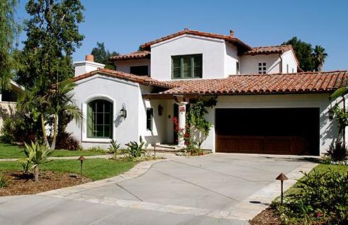
For starters, I do like the garage and the angle of the garage roof. I also like the vegetation around the home, and from certain angles, the home also seems well balanced.


However, on its own, absent the greenery, the home leaves much to be desired.
Number 1. The windows should not have the McMansion trim around them and they should not be flush with the wall. Spanish homes must have recessed windows. If they have trim, think Spanish tiles not picture frame.
Numero 2. What's with that column in the doorway? Its too thin and is unbalanced with the mass of the protruding central room. Either add an additional column or thicken this one. Good thing it has the vines growing otherwise it would look naked and out of place.
Thirdly. The window on the second floor shouldn't abut the roofline. It should float. And it should have two panes, not three. And why do the panes have such thick borders? I know the window opens, but it doesn't at all match the thinner (and preferable) pane borders on the lower window.

Last of all. Is it me, or do the angles of the roof seem too shallow - flat even? I think they need to be a tad steeper to help add visual interest and reduce overall massing. Agree?

(Source: Bing Maps)
The property overall just seems dull. Even the footprint of the home has no interest - just a mass of wood, tile and stucco. No ingenuity - no "hmmm" or "aaahhh" factor - just ordinary. Ditto on the backyard. No pool. No spa. No fountain. Just a grass yard.
Also, did anyone notice the lush front and back yard vegetation in the original home? The new home has most of those mature trees removed - what a waste! ...and all for for a home of meager architectural quality, what a crime!
KEY STATS
Location: Valmonte, PVE
Style: Spanish
Year built: 2007
Architect: EnviroTechno
Square footage: 3,138
Lot size: 11,990 (79x156)
Style: Spanish
Year built: 2007
Architect: EnviroTechno
Square footage: 3,138
Lot size: 11,990 (79x156)
3 comments:
Haha, yeah this definitely pales in comparison to the house in the previous post.
looks like a spec home:(. can tell immediately that it's newer construction rather than a renovation of an older home.
Although I like the size of the house, I think it's outside design is kind of boring. I would love to see what's inside though!
Post a Comment